Individual thesis project | 8 months, 50% time | Grad school coursework | 2014
PROJECT oVERVIEW
I delved into a 'mini wicked problem' for my Masters thesis project: what causes Grand Canyon National Park to become a perfect storm of visitor calamity, and what interventions be able to help decrease the high rate of rescues?
I used design research to explore what makes Grand Canyon so dangerous for visitors, and to audit current visitor safety efforts. Then I used a variety of synthesis methods, as well as looking to behavioral science and risk management, to understand further what I had found. Then I explored how we might improve the situation by utilizing tools and best practices from information design, interaction design, service design and behavioral design to encourage better decision making, and nudge visitors towards safer choices.
Download the final thesis document from CMU's Thesis Repository, or read on for the (somewhat) condensed process story.
PROCESS IN-DEPTH
STAGE 1
RESEARCH: ESTABLISHING THE AS-IS
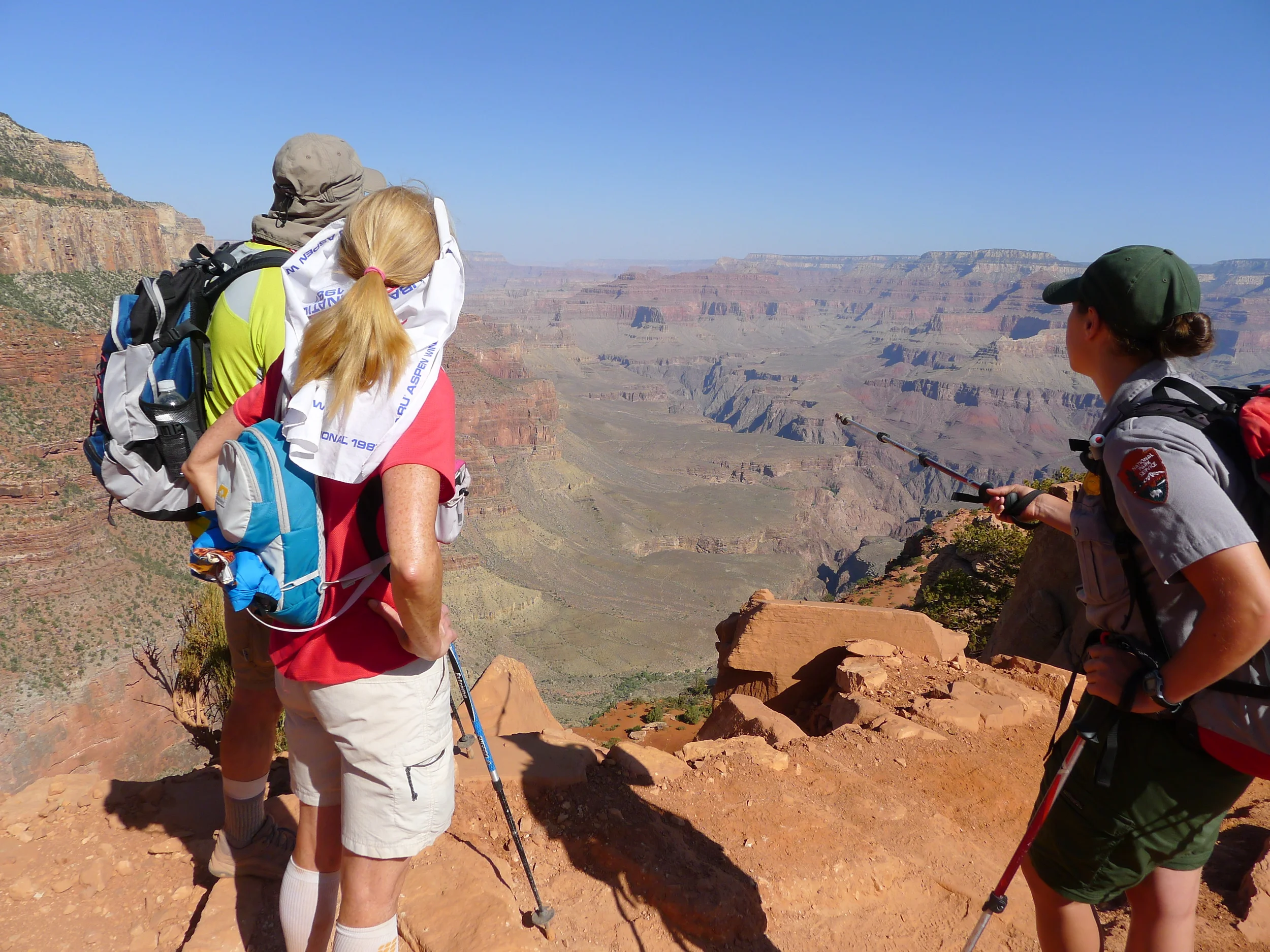
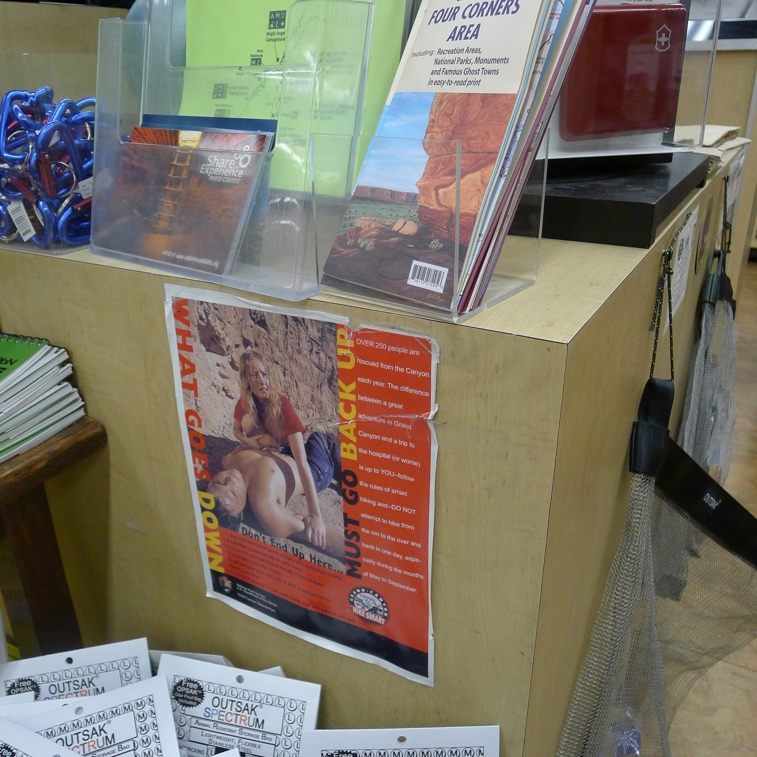
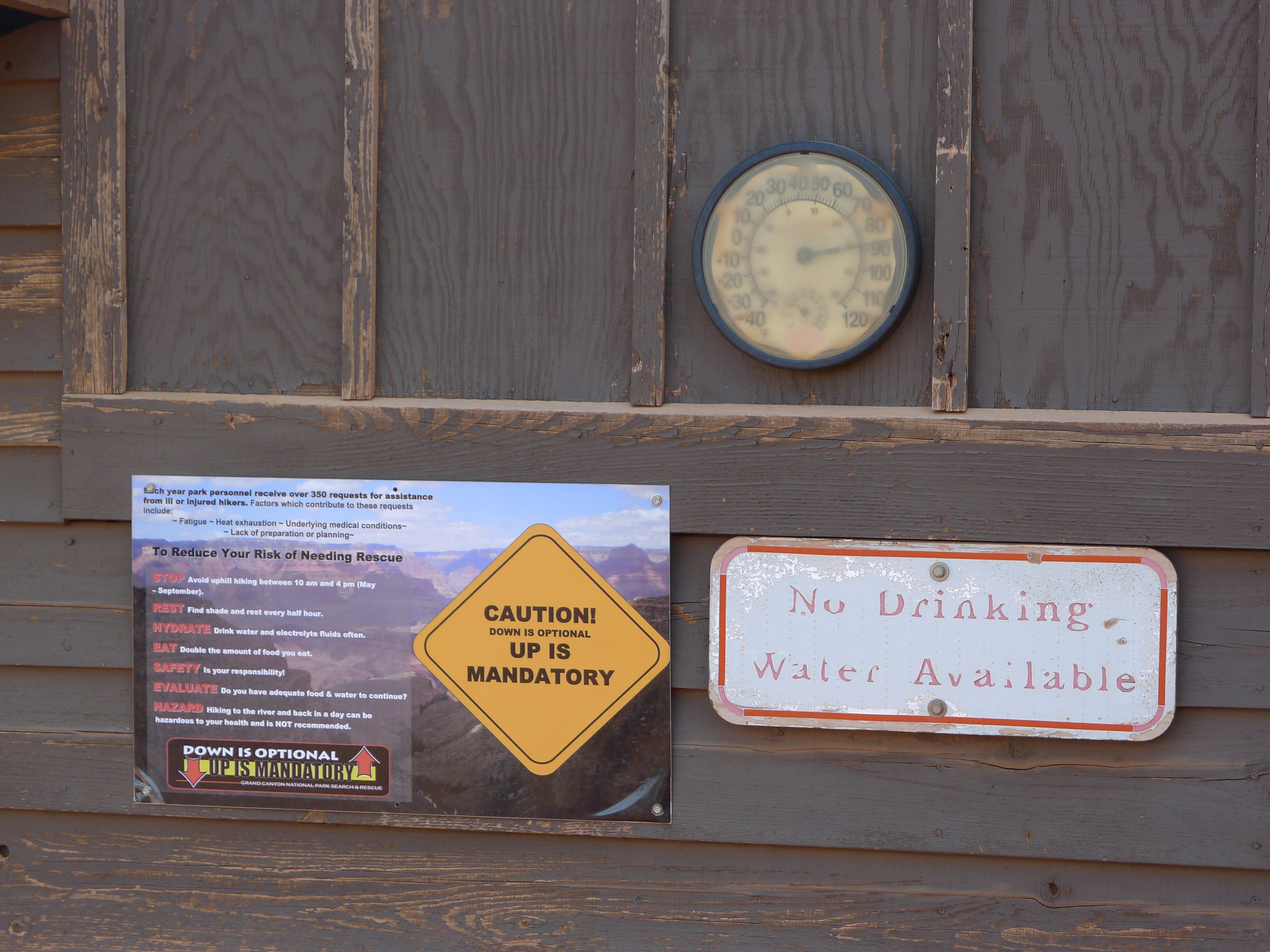
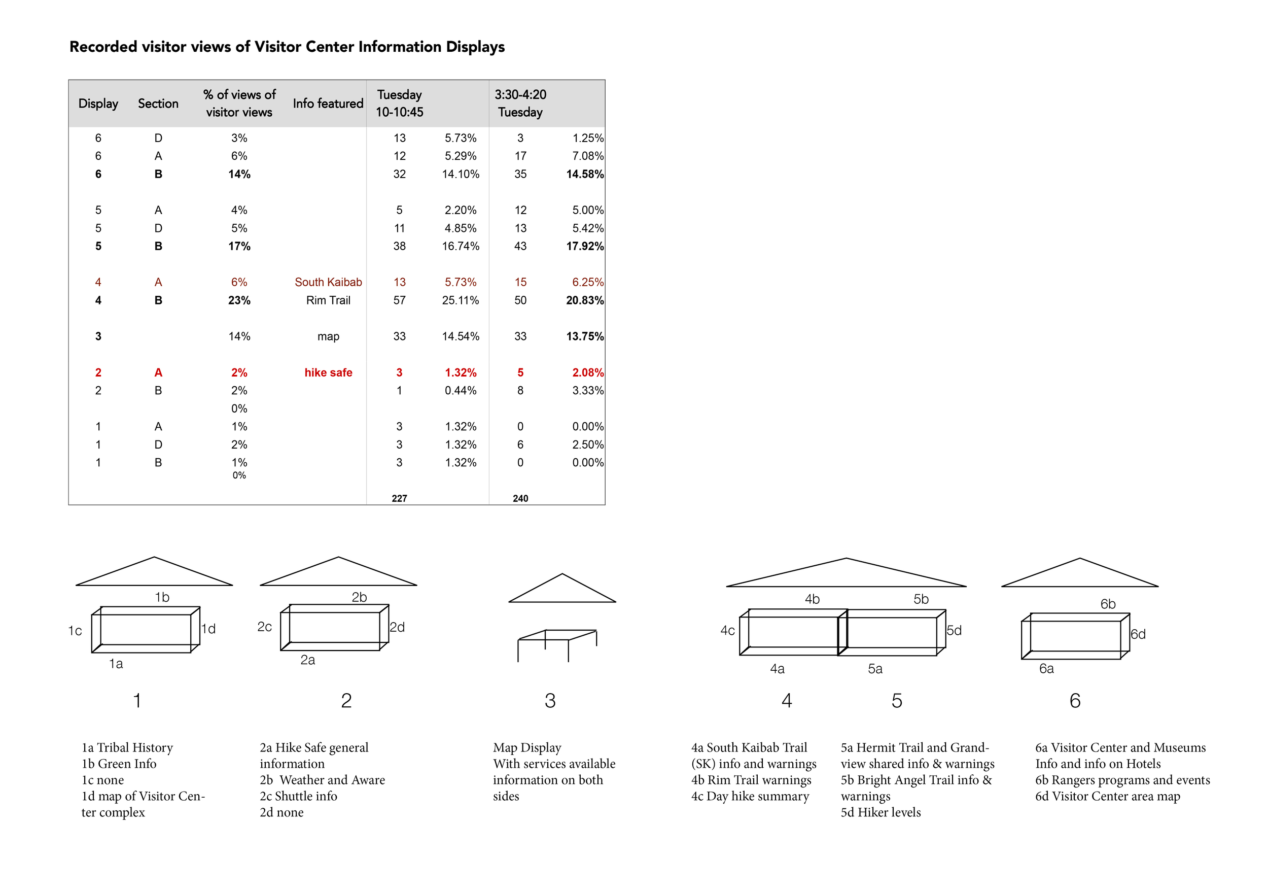
I spent 8 days at the Grand Canyon conducting field research, shadowing and interviewing Park Rangers, observing and talking with visitors and auditing the current safety and information touchpoints. I grouped my exploratory research around six different discovery focus areas:
In addition to my field research, I also conducted extensive secondary research around existing work on the subject matter and best practices from both design and other applicable fields. A breakdown of how research endeavors map the discovery topics can be viewed below:
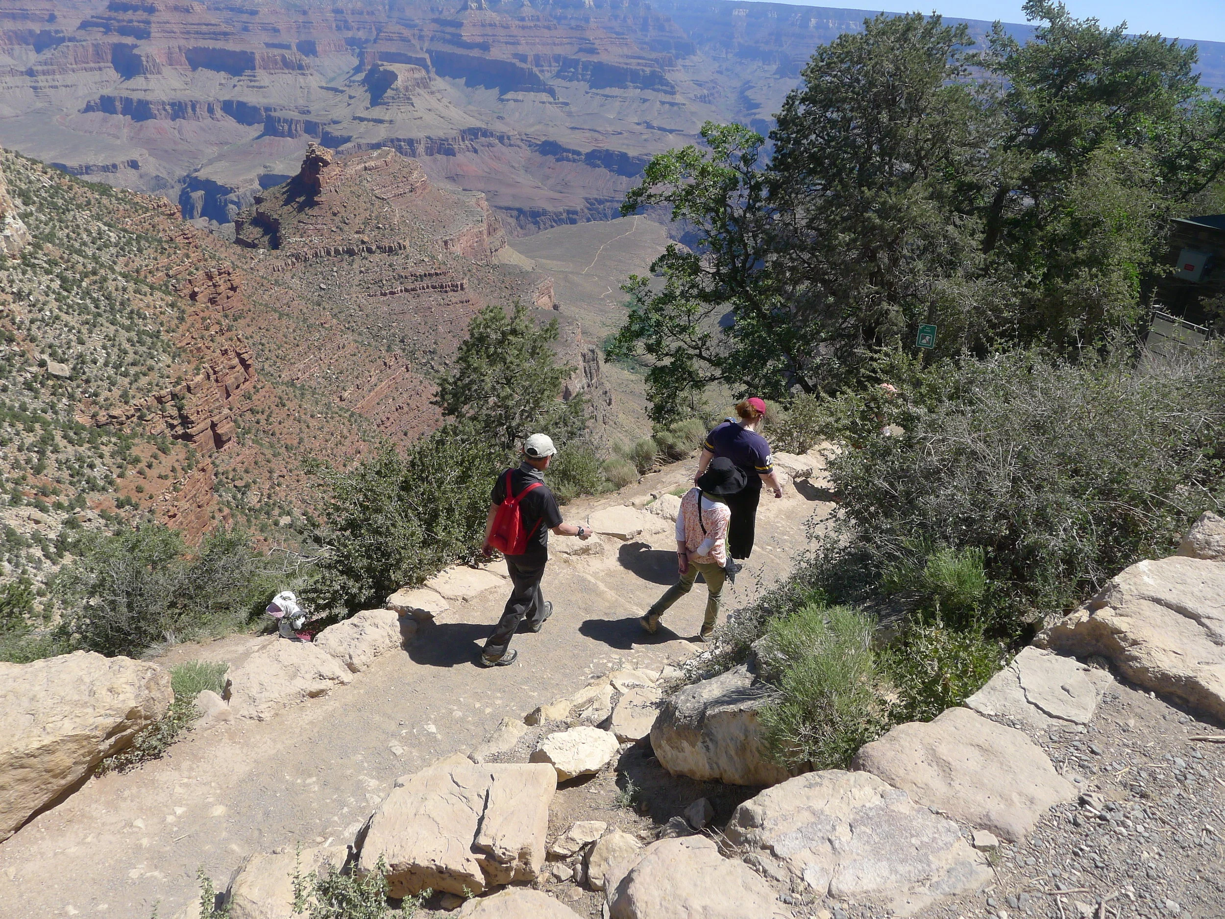
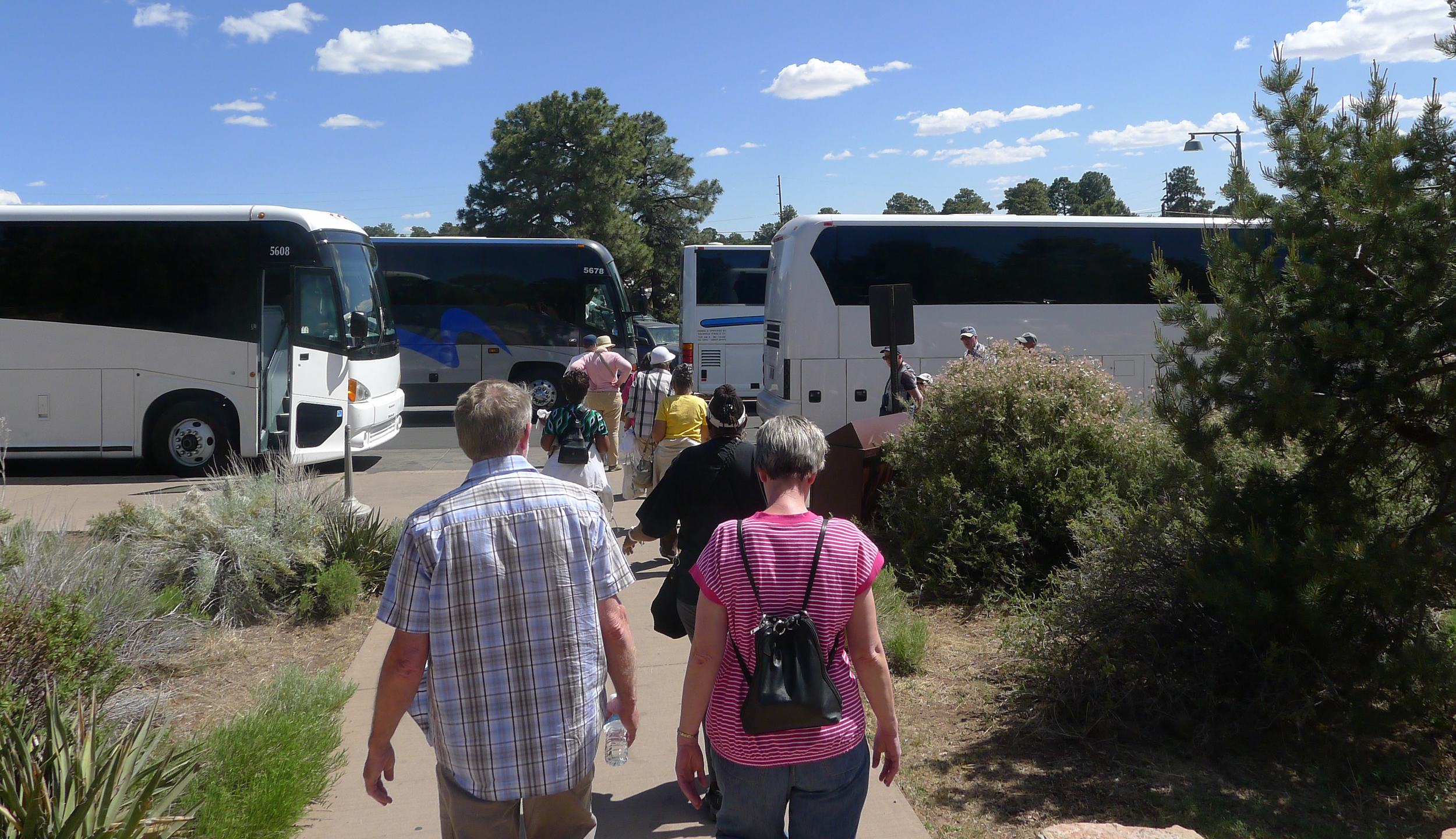
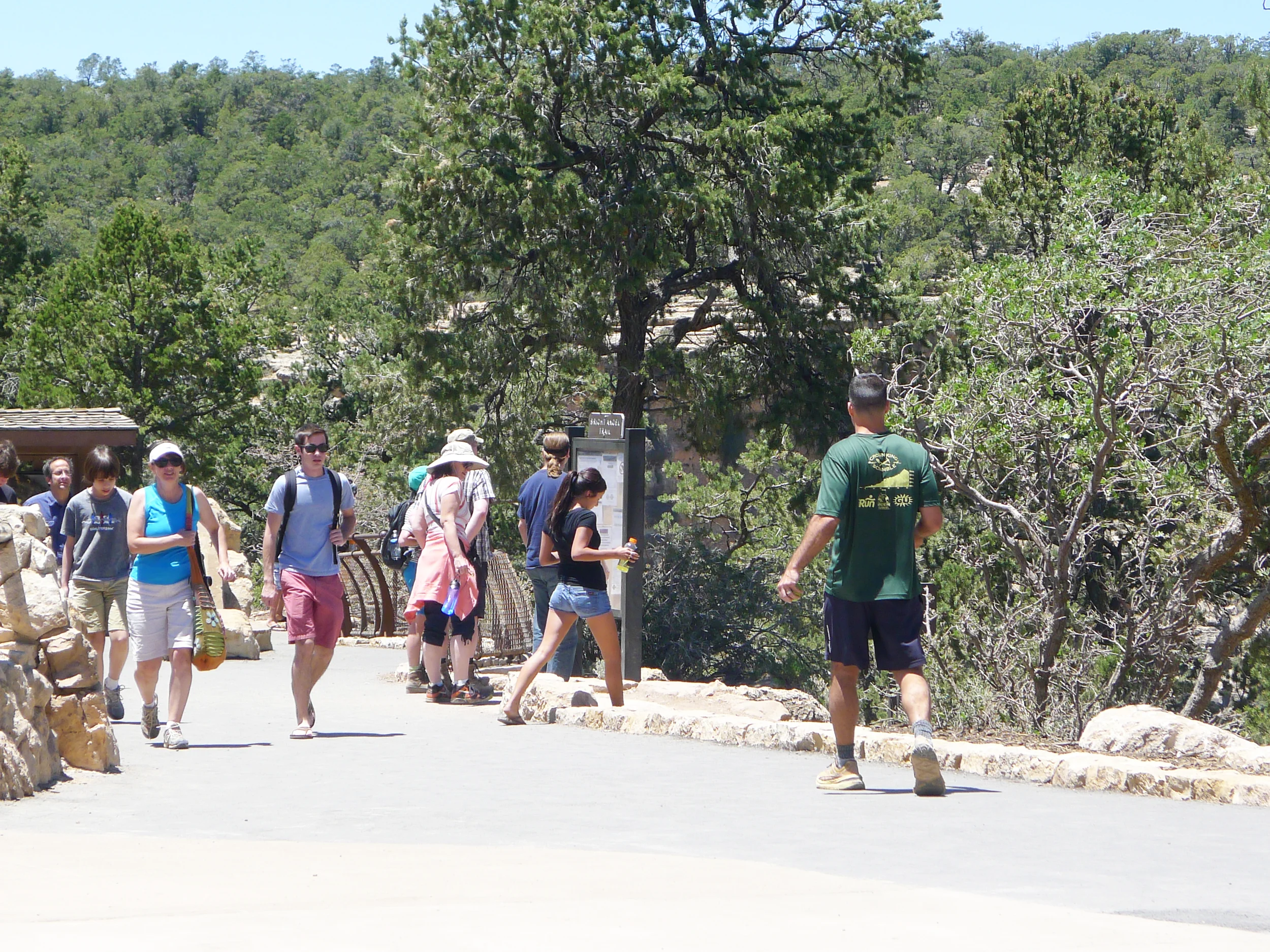
One interesting finding from my field research was around who hikes at the Grand Canyon. I decided to refer primarily to "visitors" in my thesis rather than "hikers" because most people hiking at the Grand Canyon aren't "hikers" at all - they're just normal people who hike when they come to a famous National Park because it's "the thing" to do there. Many are traveling in groups, and add a stop at the Canyon to a larger roadtrip or a vacation in Las Vegas.
STAGE 2
SYNTHESIS: WHAT IS REALLY HAPPENING & WHAT NEEDS TO CHANGE?
My research trip was extremely helpful, but it also created a massive amount of data and insights for one person to synthesize. Since I had sought out not only to understand the problem’s “as-is” state, but to attempt to get to the bottom of it, there was alot to process.
INITIAL SYNTHESIS
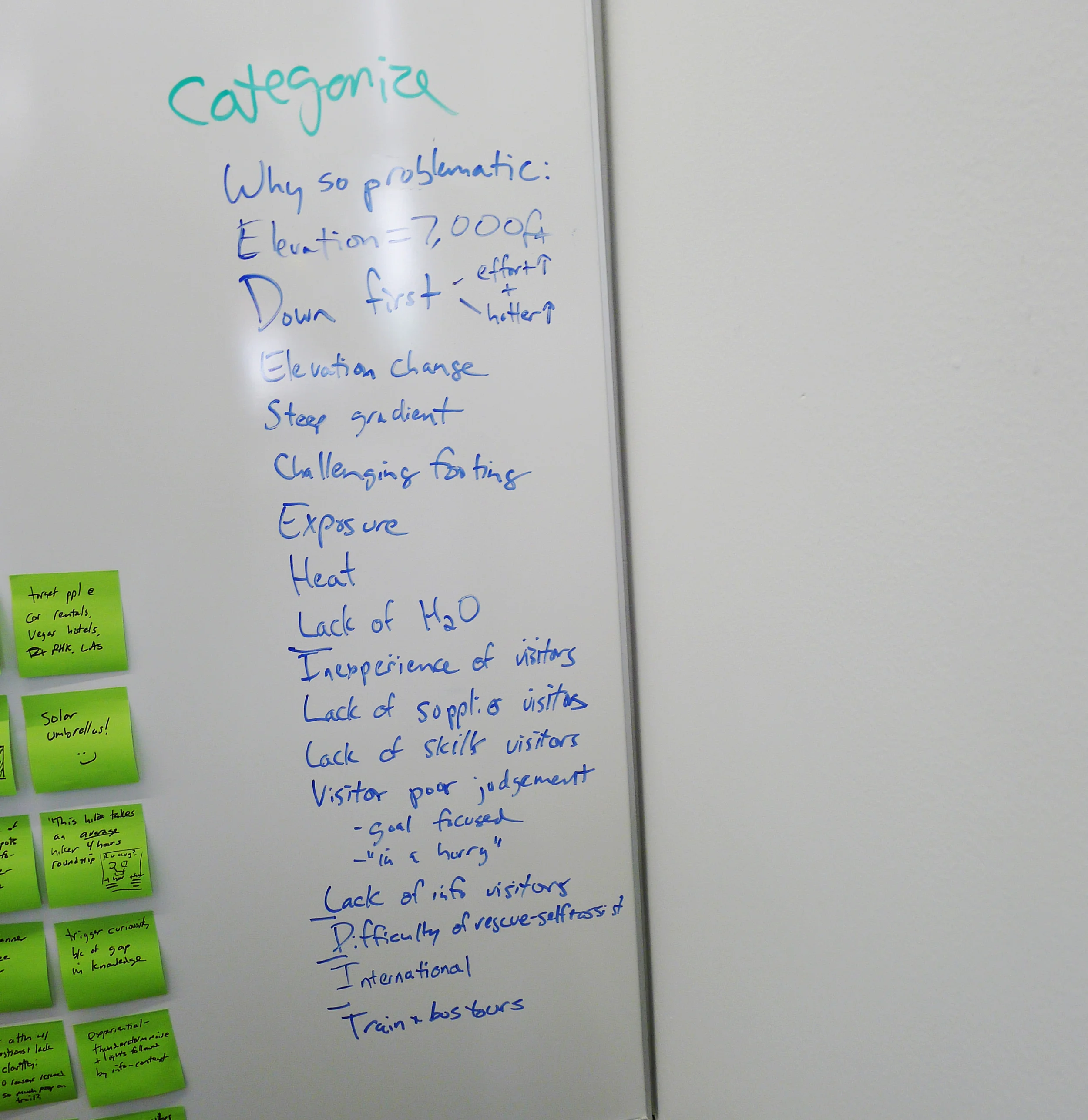
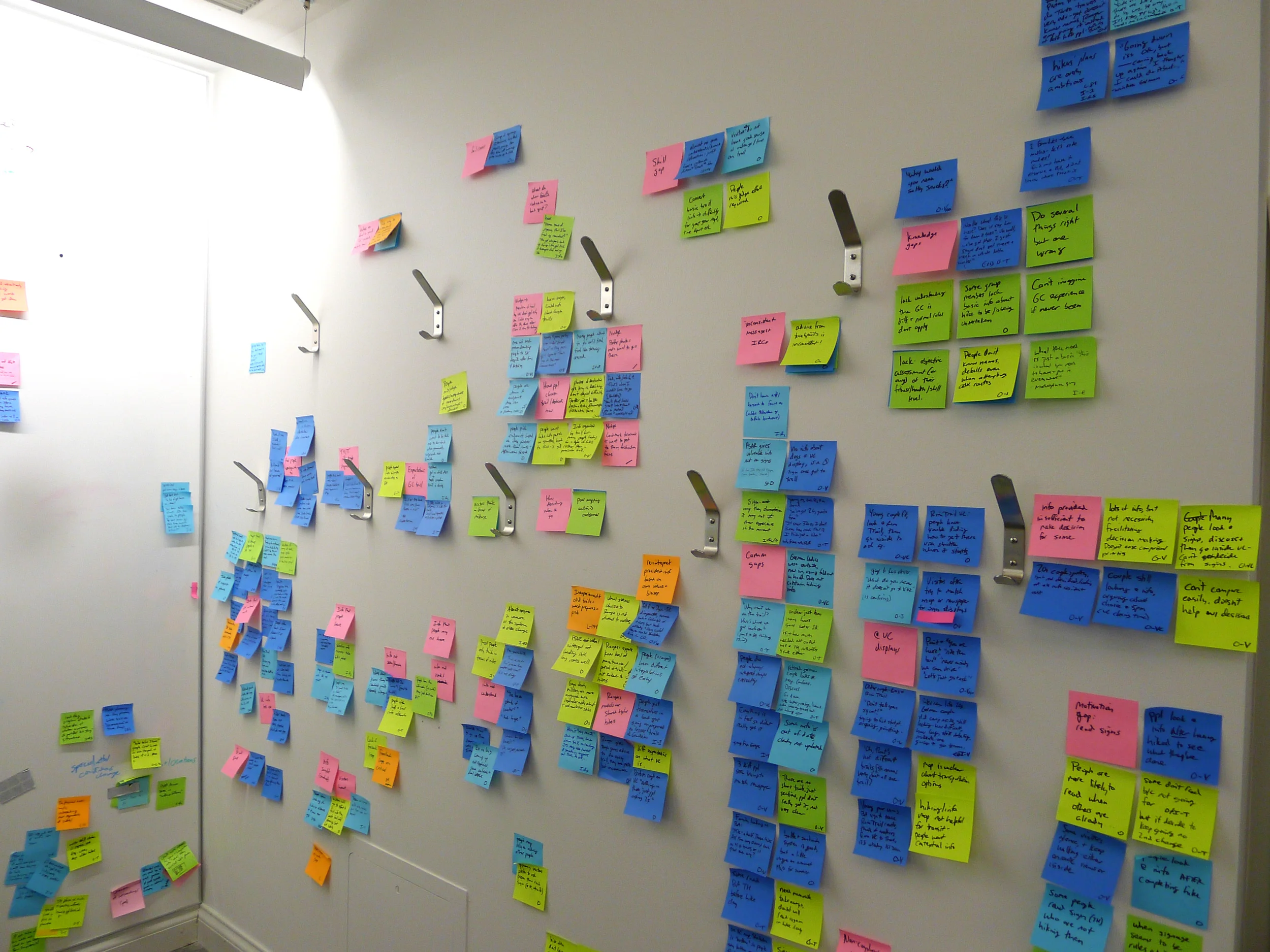
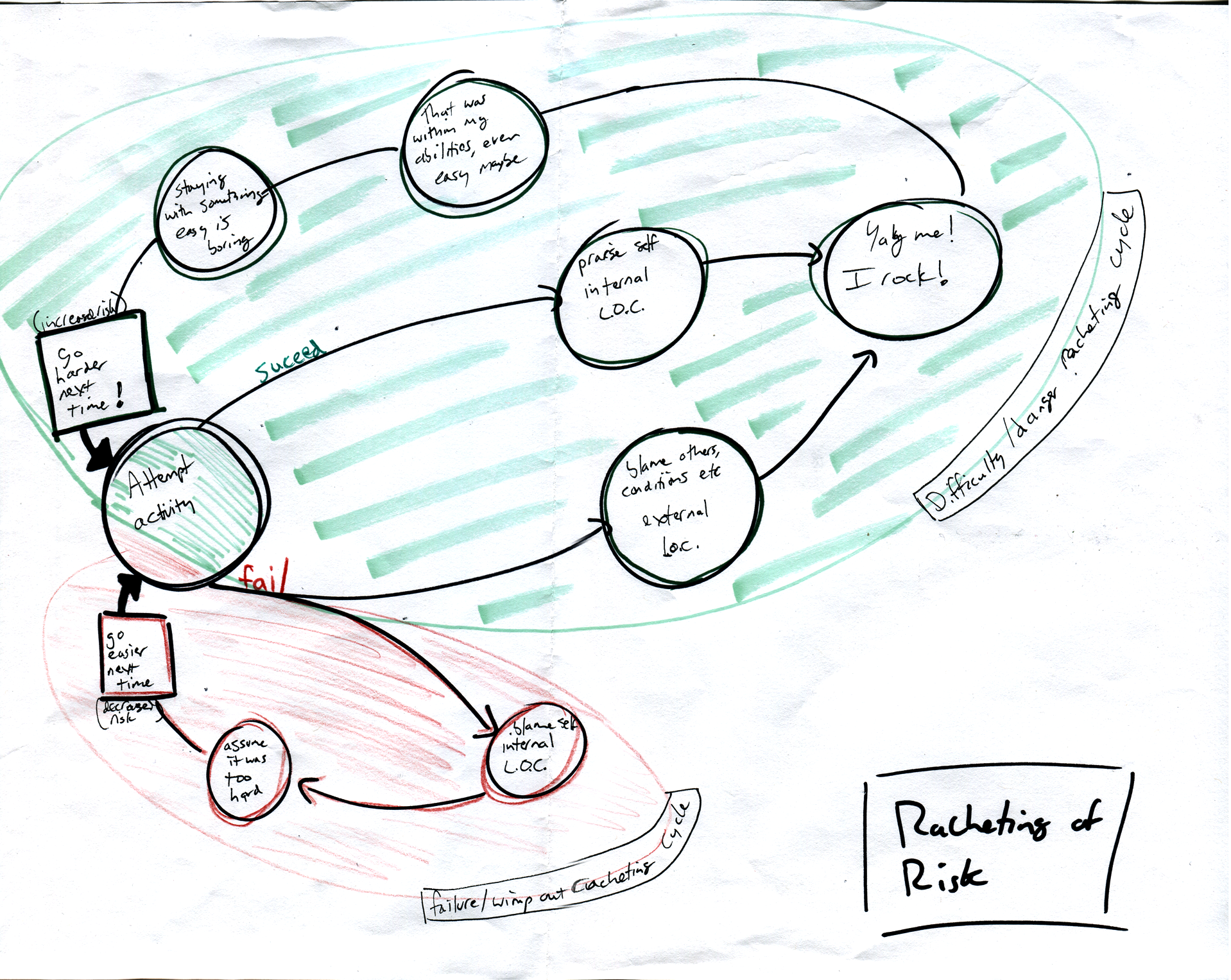
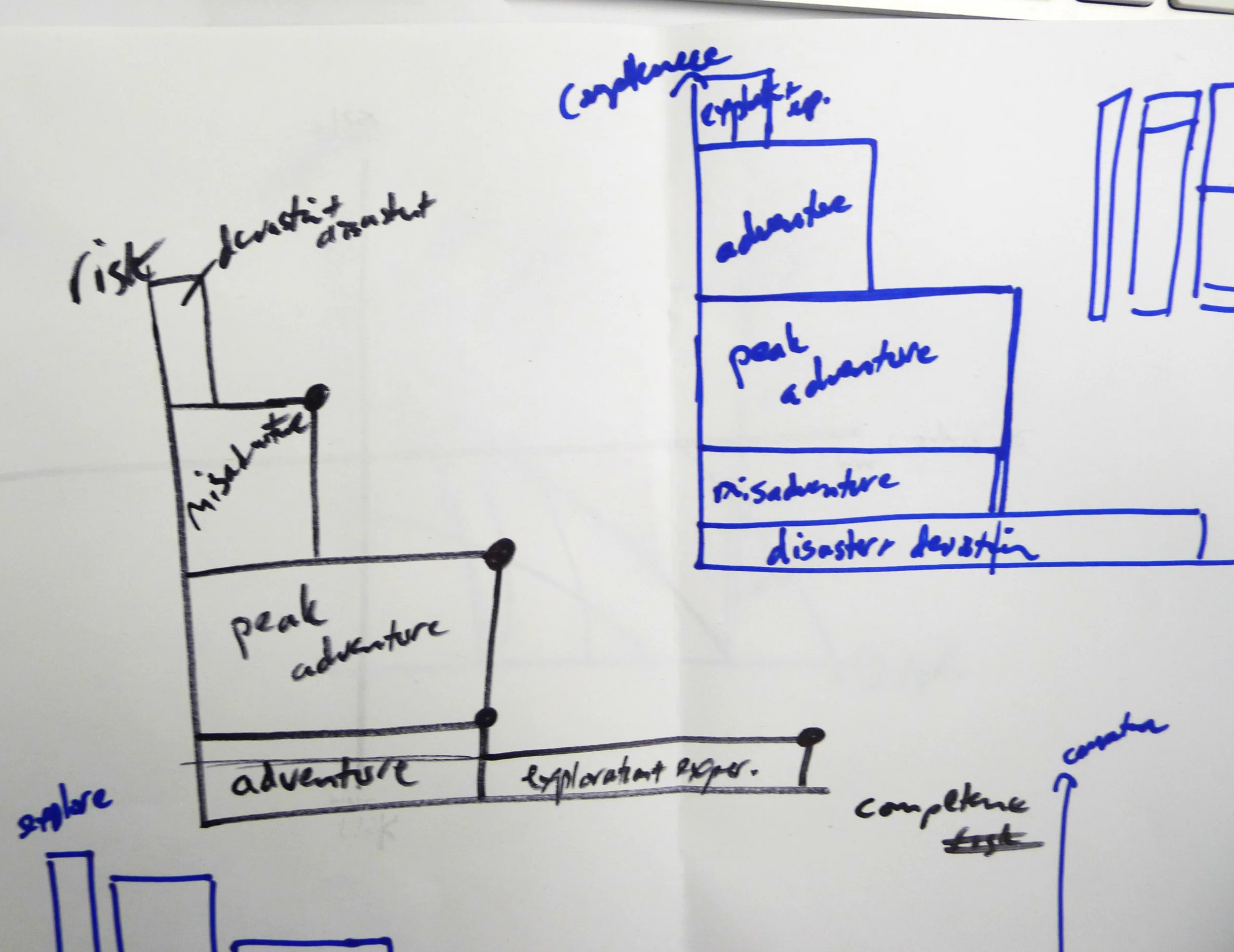
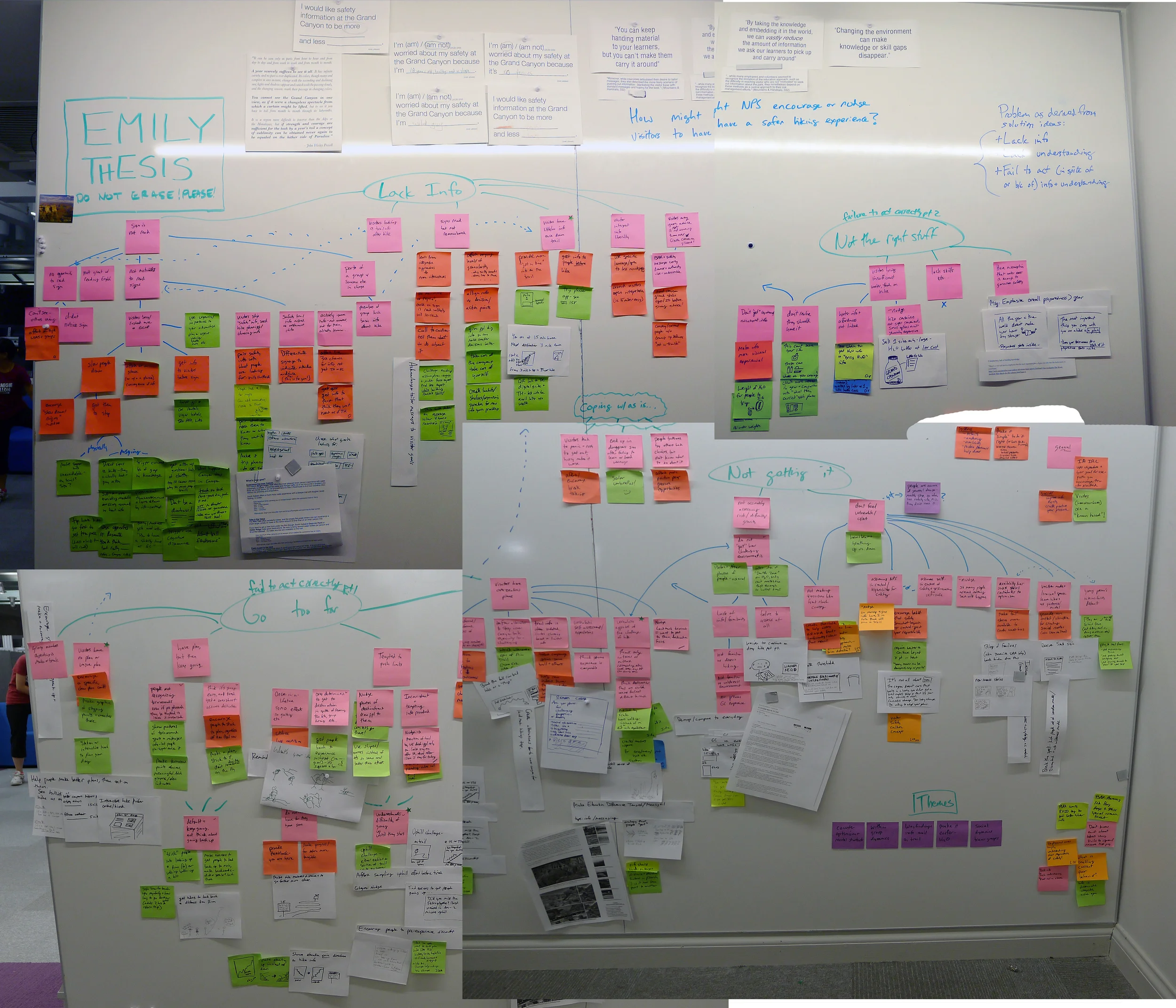
I used frameworks, diagramming, ideation, and affinity clustering to try to boil down the key things I had learned:
MAKING TO UNDERSTAND BETTER
As I was working to synthesize and stay true to my research findings, possible intervention ideas were constantly popping into my head. Sometimes I simply post-it noted them and added them to an ideas parking lot. But I found that playing with some of these ideas could be a helpful way to pick the forest out through the trees:
I clustered my ideas to see which problems I was innately draw towards solving, and why I thought that lever would work. This allowed me to work both forwards and backwards to reach a better understanding of the problems at hand, and how they interacted with one another.
I also looped back to many of the theories and methods I had discovered in my exploratory research, drawing from risk communications, behavior science, and design. I was beginning to feel like I had a handle on what was going on, but it was still rather complex and interrelated, with a constellation of opportunities for improvement rather than a single unifying need.
KEY THEMES
I found there were some key themes that bubbled up to the top level of the "why" tree of what led visitors to problems. I found that visitors lacked the information they needed, they didn't have the right stuff for their hike, they were going farther than it was safe for them to go, and they weren't really understanding what they were getting themselves into.
ORDER OF OPERATIONS
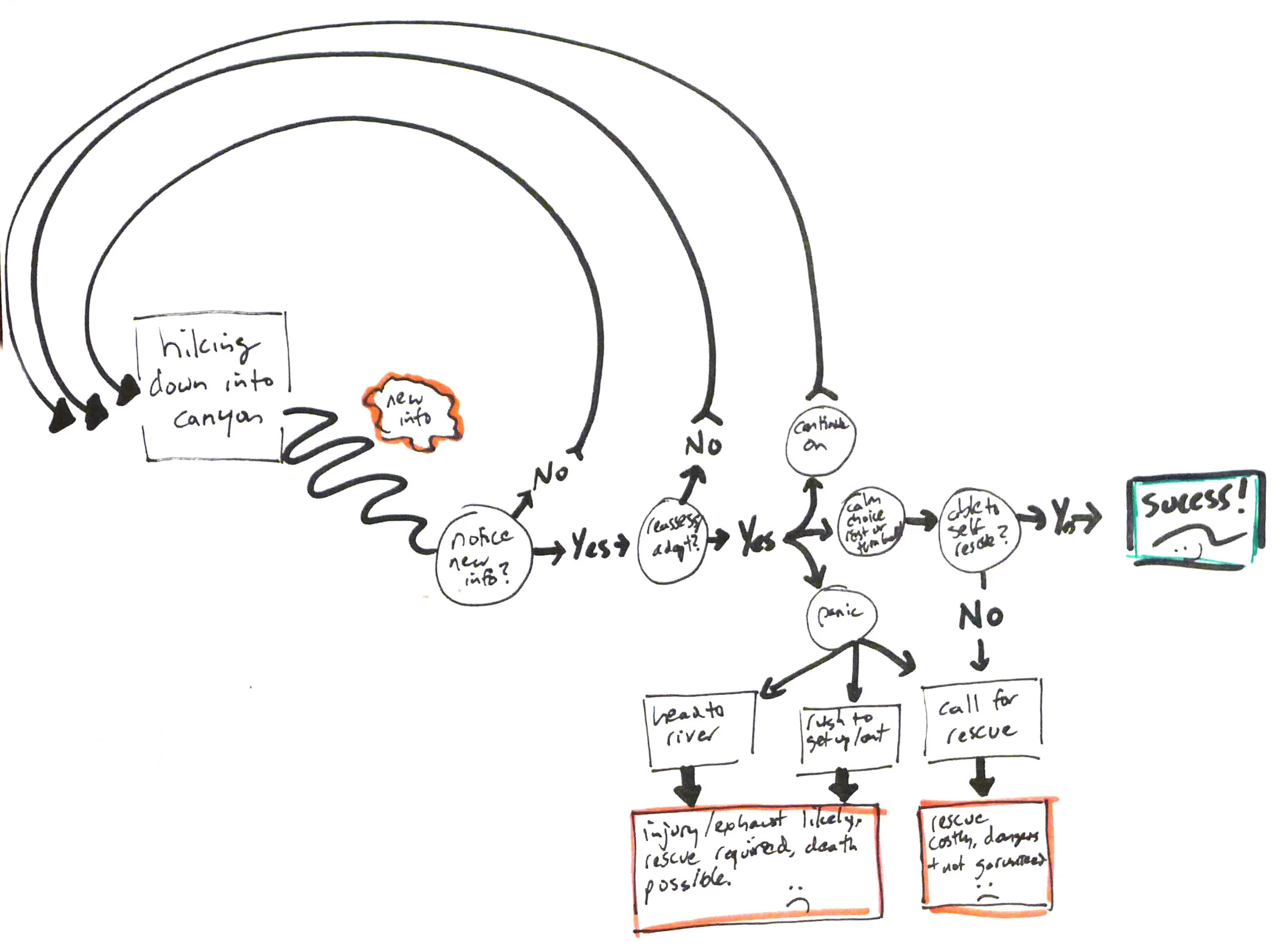
Another key synthesis finding was that visitors usually do "get" that the Canyon is hot, difficult to hike, and that they're out of shape, didn't know what to expect, and didn't bring enough supplies -- AFTER they're well into their hike when it is too late to prepare or choose better:
PREFERRED ORDER of understandings (pink) to inform actions (purple). For instance, visitors should choose which trail to take based on understanding the challenges of the Canyon, and how difficult the hike being considered is, and what their group's fitness level is. Ideally each of the purple decisions are thoughtfully and actively made.
OBSERVED ORDER of understandings (pink) coming after actions (purple). For instance, visitors often aren't even actively choosing a specific hike thoughtfully, and then they aren't realizing their group's ability level, or how hard their hike is until after they have, for reason, turned around and headed back uphill. This is obviously a bad time to realize you've chosen to hard of a hike because your only options at that point are to complete the hike back out of the canyon, or call for rescue.
This meant that a key challenge was how to try to help visitors gain this understanding sooner - or be prepared to guide them more at the moments when they actually realize they need help.
AS-AS FINDINGS SYNTHESIS
At the halfway point of the project we have a poster presentation to read out what we've done so far, and where we are headed. It was a challenge to boil down everything I had learned so far into a 15 minute talk and a single poster, but the forcing function helped crystalize my key learnings.
View the key diagrams below (click to enlarge) or view the full poster PDF in a new window.
INITIAL IDEATION
In addition to sharing my findings about the As-Is state, my poster also included a few initial thoughts on possible intervention directions, flip through below:


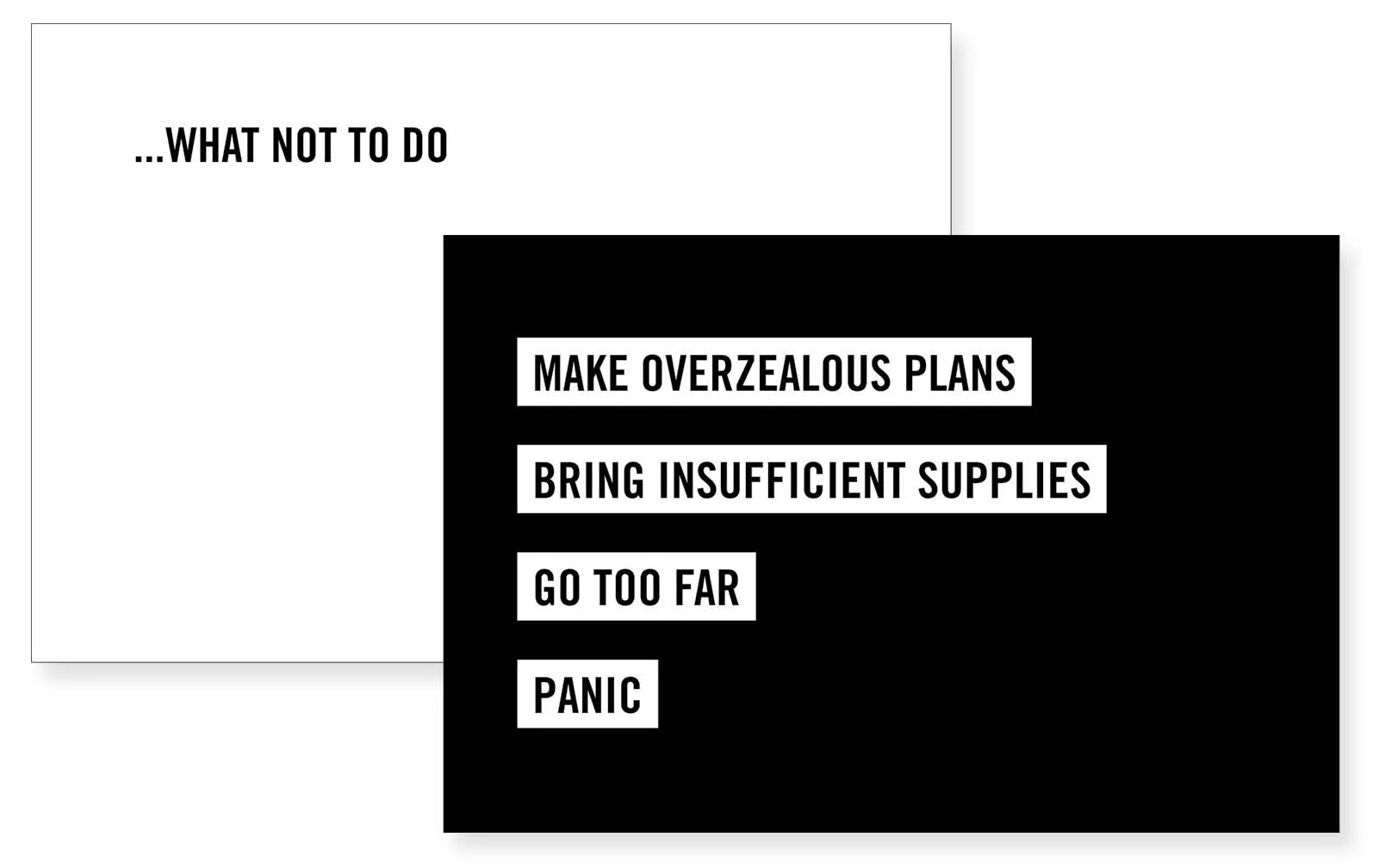
I also made a fun postcard highlighting the key items that I'd found hikers should NOT do, because they are also kinda good advice for life in general:
STAGE 3
DEVELOPING & TESTING THE Hike ADvISOR TOOL CONCEPT
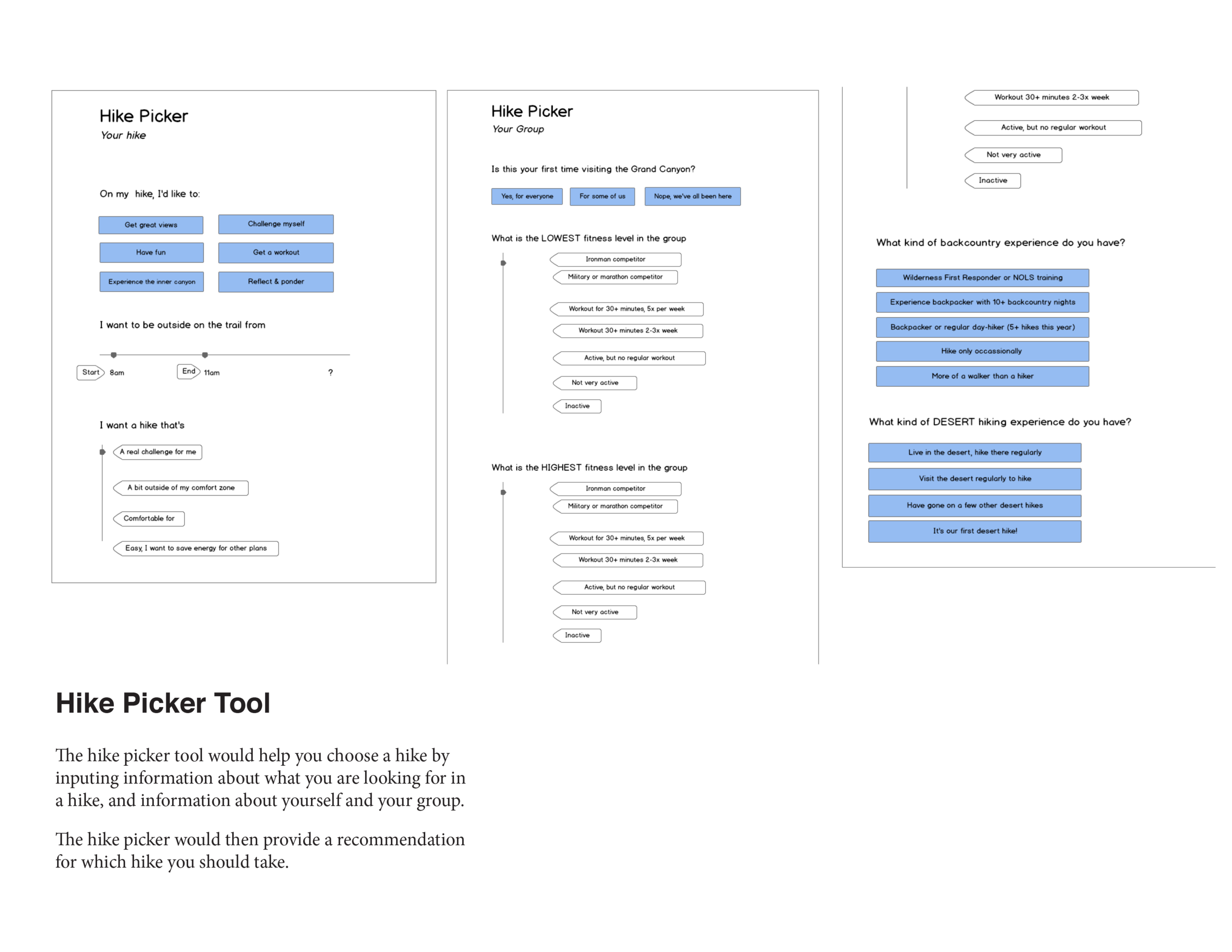
As I moved from the understanding the problem and its context to considering possible interventions, one possible direction I wanted to explore was a hike planner tool. This could help close the knowledge gap, and aide visitors in matching their skills and interests to an appropriate activity. It was also the most interactive and technological of my intervention options, so it could be a good fit to spend more time iterating on.
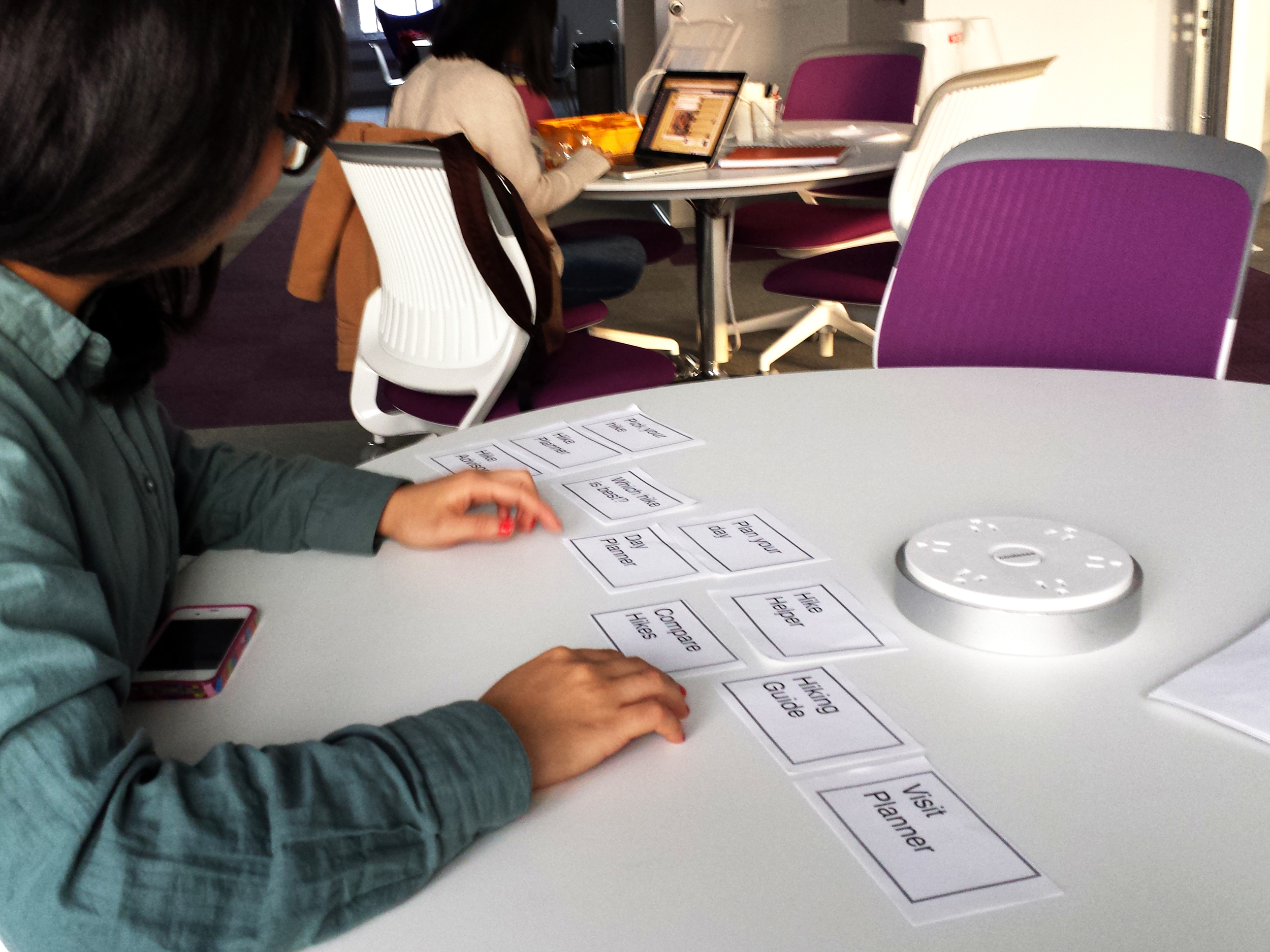
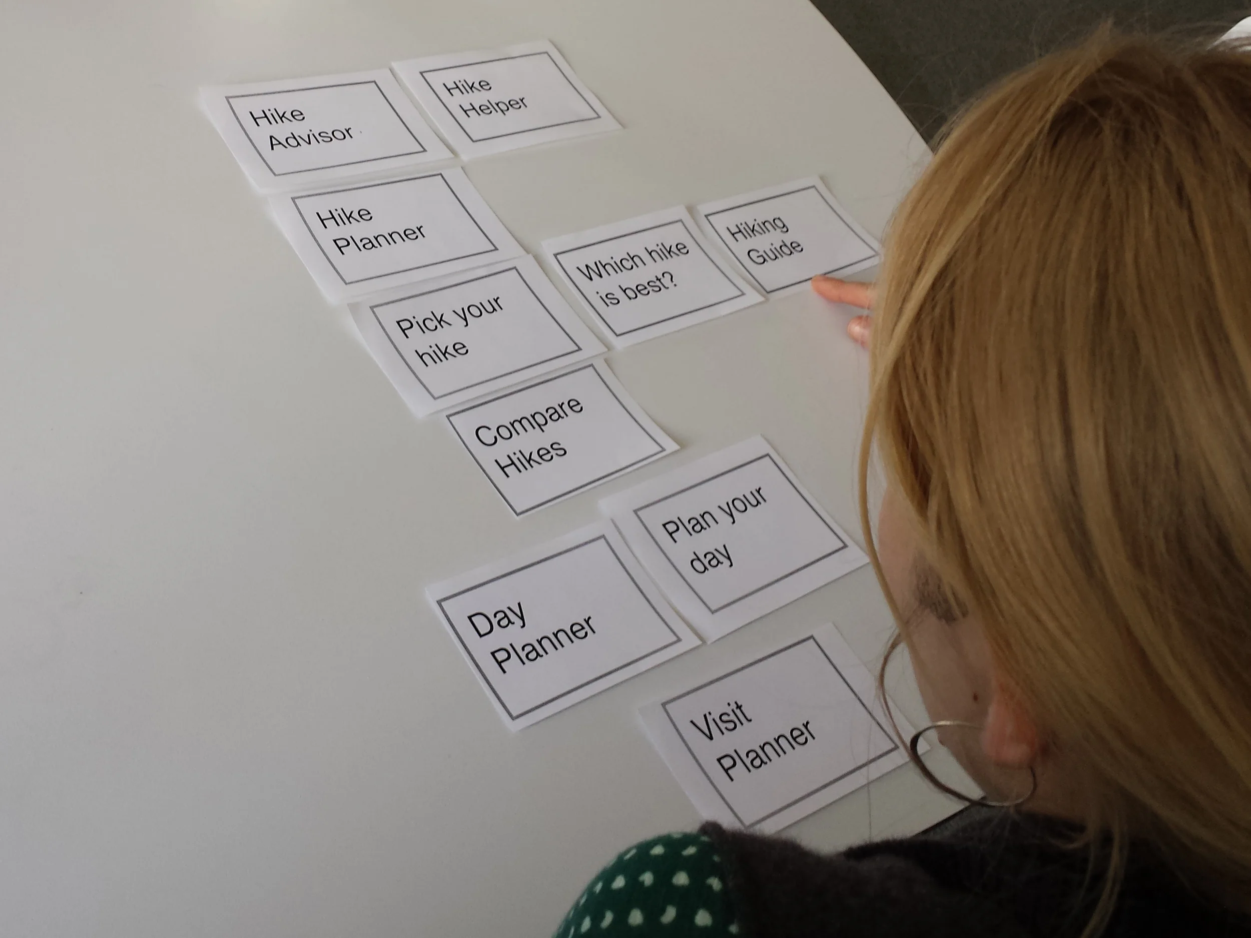
I first asked participants to interact with existing information sources, and asked which hike they would choose based on this material. Then I speed-dated a few low-fi concepts that showed the kind of functionality an on-site activity choosing tool would have, and used a card sort to prompt a discussion and probe at people's expectations and needs were around hike planning.
I was right that low-fi concepts were all I needed to learn if this approach could be fruitful - the feedback I received from testing these concepts was invaluable, and pushed me back away from a digital solution. Testers were offended by the idea of tech at the trailhead, without even being asked about it, and this was coming from CMU students!
I also found that planners will have already planned before reaching the park, and that most of my problem hikers won’t want to engage with a planning tool in this way. While I was interested in using this project to explore the digital form a bit more, I was also excited to pivot back a larger world of possible intervention approaches and artifacts. My findings from this probe also aligned with my "order of operations" hypothesis that hikers didn't yet know they need help when they're about to start their hike.
STAGE 4
DESIGN CONSIDERATIONS
After sharing my new understanding of the as-is, analyzing the current intervention approaches, ideating some possible solutions, and testing one particular approach I had further solidified my approach to designing some possible interventions. I still didn't know what the right answer was, but I had a good idea of what the goals of the interventions should be.
STRATEGIC APPROACHES
ENABLE INFORMED CHOICES
I wanted to address some of the key issues than I had identified with current interventions when crafting my own. I had found that:
Visitors are seeking hike planning and choosing information, not safety information
Visitors have difficulty comparing hikes to each other and choosing one
Information touchpoints often aren’t convenient for or relevant to visitors
By providing critical information in a visitor-accessible manner and at the right time and place, I hoped that visitors will be more likely to make the preferred, safer choice at the key decision points I identified: Choosing a hike, choosing which supplies to bring, and choosing to turnaround. So:
How might we enable informed choices?
Afford and guide comparison
Create distinct decision points
Co-locate information with decision points
Mimic visitors’ decision approach
COUNTER OPTIMISM BIAS
As long as visitors are overconfident, they are likely to remain "deluded", dismissing warnings as intended for other people and making overzealous plans. I propose that by helping visitors be a little less optimistic, they can more accurately assess themselves and their hike, leading to smarter choices that decrease the visitor-hike mismatch. Countering optimism bias should also encourage them to realize more quickly when they are outmatched.
How might we counter optimism bias?
Redirect visitors’ attention to overlooked information
Use contrast to draw attention
Increase availability of overlooked criteria
Make overlooked criteria easy to grasp
Increase availability of poor outcomes and base rates
Create feedback loops
Highlight options and decision opportunities
Use information to empower less optimistic group members
BOOST ALTERNATIVES
I found visitors often do not have a strong idea of which activities they want to engage in in advance. Instead, they look to find out what is “the” thing to do at the Park. Redirecting these defaults away from dangerous hikes could yield major safety gains.
How might we boost alternatives?
Provide visitors with more medium options
Allow visitors to get a sense of accomplishment without
endangering themselves
Make safe activities be and/or seem more compelling
Emphasize experience over checklist accomplishments
TACTICAL DESIGN CRITERIA
1. To reach visitors, interventions should:
Be placed on-site at the Park
Be accessible and usable by a high volume of visitors
Be hard to avoid
Be readable and professional
2. To work within the park system, interventions should:
Work with the Park’s laissez faire policy
Be economical
Stand up to environmental challenges
Provide helpful guidance without requiring a person
3. To appeal to visitors, interventions should:
Provide the information visitors seek
Afford at-a-glance use
Afford interaction without relying on digital
Be group-friendly
4. To enlighten rather than confuse, interventions should:
Use hierarchy to make clear what’s most important
Minimize words where possible, while maintaining clarity
Provide varied levels of information
Be consistent across channels, touchpoints
Aid decision-making or provide how-to knowledge
Assume no prior knowledge
Use everyday language AND make measurements meaningful
Meet visitors where they areUse specifics to illustrate a larger point
Make it easier to do the right thing
Utilize the power of affect
STAGE 5
SACRIFICIAL CONCEPTS
Having learned much more about the nature of the problem through testing just one possible solution, I wanted to explore more of my possible interventions and get feedback on each to really test my insights and principles. Unfortunately my time was limited so I didn't have a chance to iterate much, or get formal user feedback on my intervention ideas.
Instead, these concepts serve as "conversation starters" that help illustrate what I learned and some ways we might begin to tackle this issue.
VISITOR-CENTERED INFORMATION
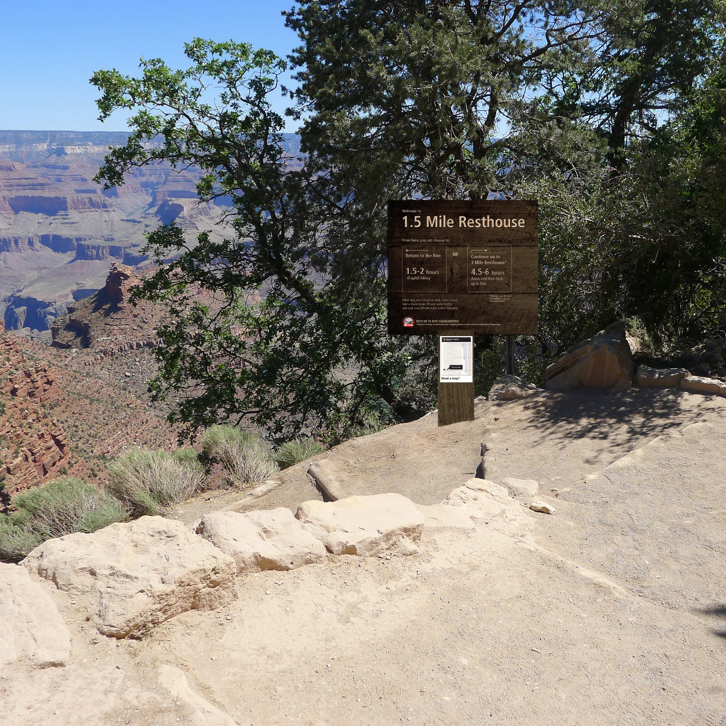
ON-TRAIL INFORMATIONAL SIGNAGE creates a designated decision point, precipitating group discussion. By framing the choice unambiguously as one of turn back now or continue on with a longer return hike, it challenges the tendency of visitors to mindlessly continue down the trail and encourages reluctant group members to speak up.
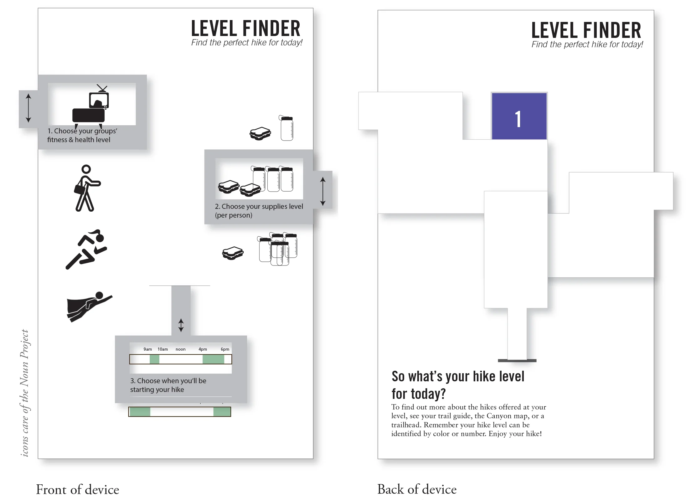
DESIGNATED HIKING LEVELS makes it easier for visitors to gauge the overall difficulty of hike sections, and pairing this system with the LEVEL FINDER helps visitors choose the appropriate hike.
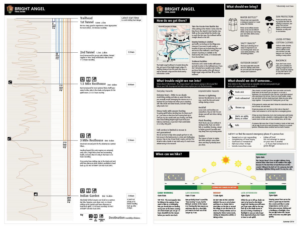
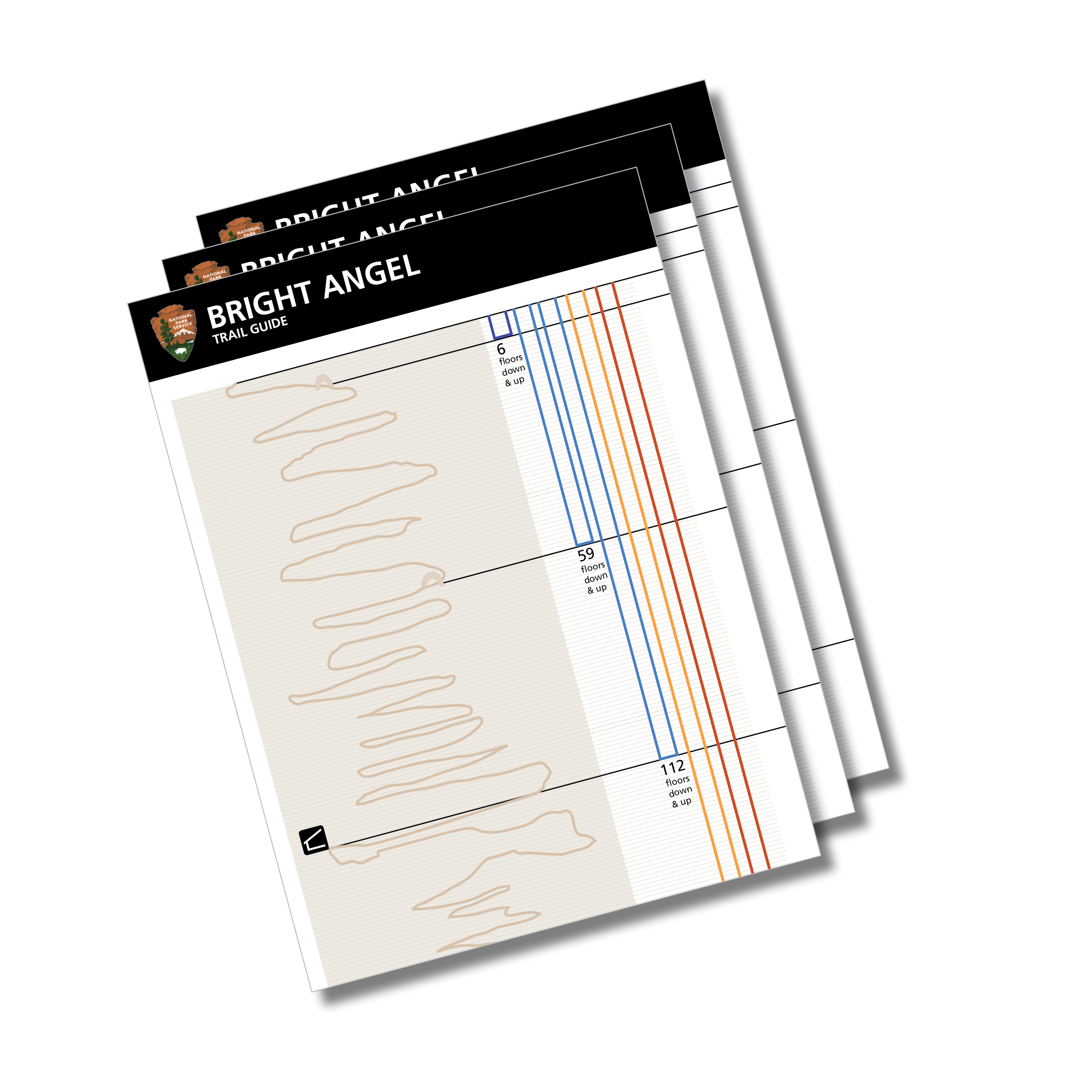
AN ELEVATION-BASED MAP is designed to highlight elevation and effort and combat optimism bias by encouraging visitors to think about the way back uphill right from the start. THE TRAIL GUIDE pairs the elevation guide with important safety and hazard information to empower visitors and remind them that things can and do go wrong.
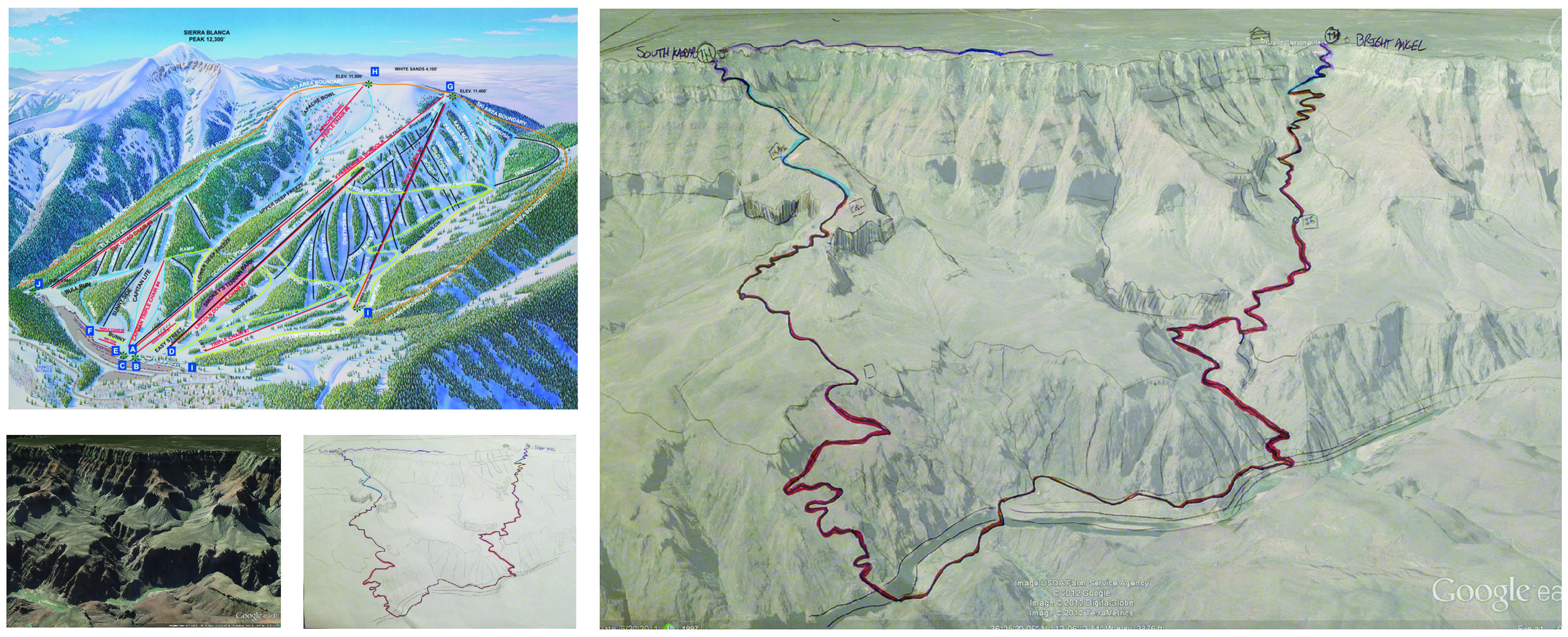
AN OVERVIEW MAP, styled similar to a ski resort trail map, highlights varying Hike Levels and allows visitors to visually compare trail length and steepness. A hawk’s eye view makes elevation change much more apparent and provides a sense of scale to help visitors begin to grasp the immensity of the canyon.
EXPERIENTIAL PROMPTS
Helping visitors "get" the challenges of the canyon better before they begin a hike would help them make smarter choicer and be better prepared, but it's also a big challenge, because behavioral science tells us it's extremely hard to help people understand something experiential before they actually experienced it.
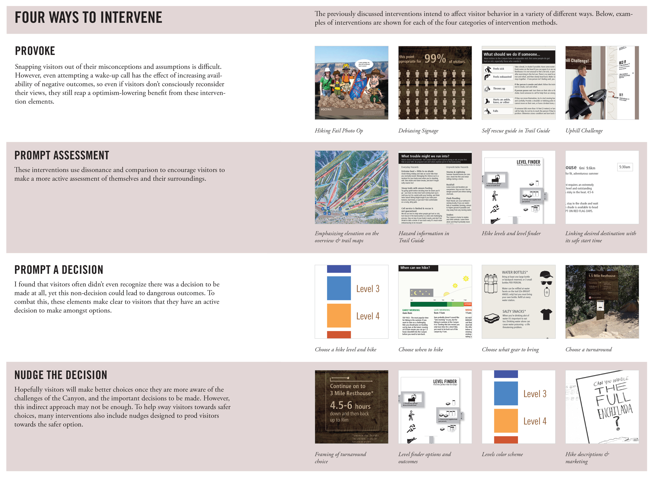
These concepts attempt to put visitors into an experiential mindset, to help increase the availability of poor outcomes, and to frame the hike as a challenge, rather than just a fun day out:
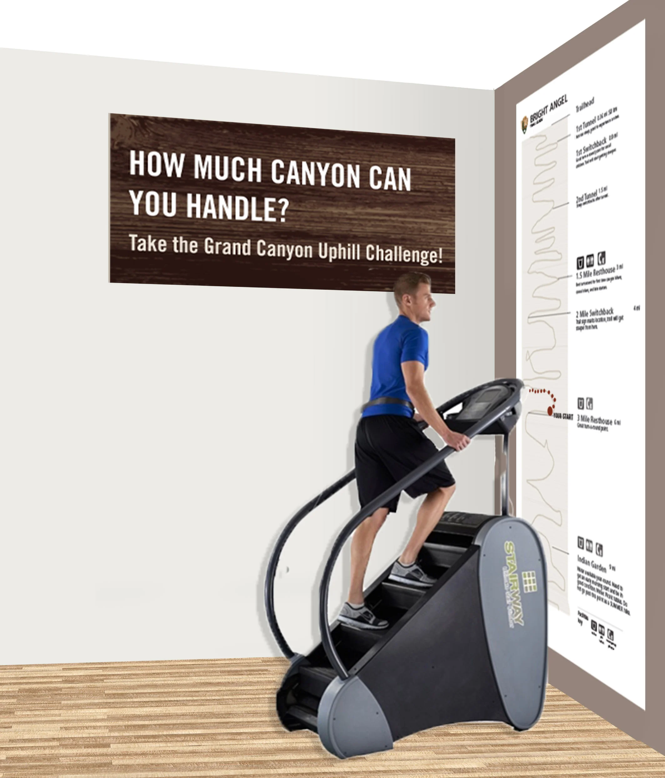
The UPHILL CHALLENGE creates a fun, interactive way to close the hot-cold empathy and perception gaps by letting visitors experience the challenges of uphill hiking at the Grand Canyon before they actually head out to hike.
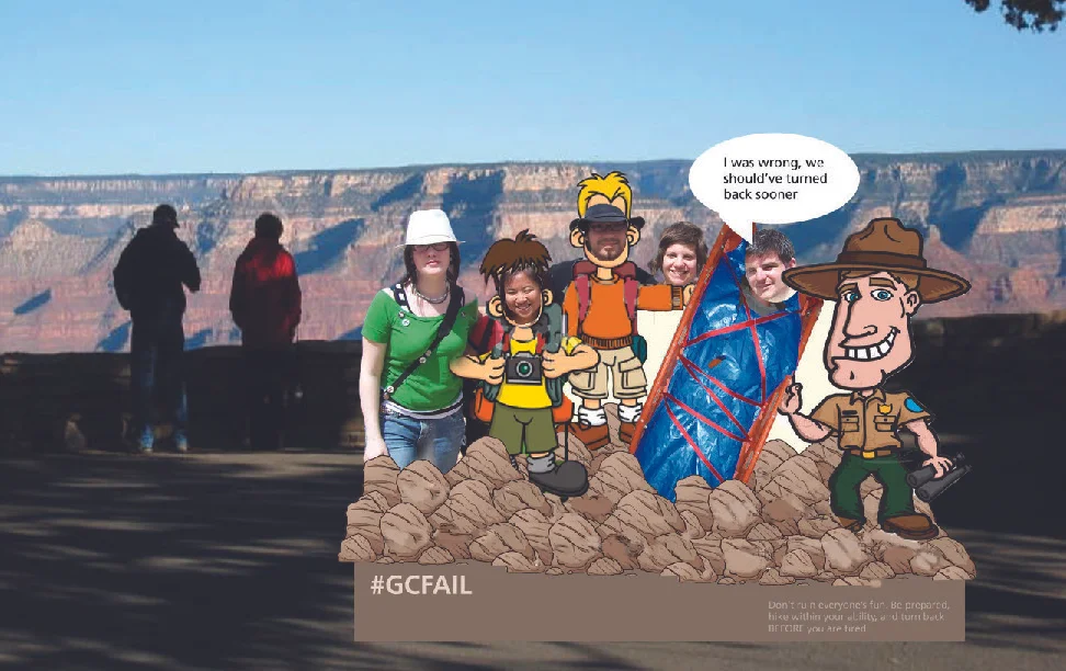
#FAIL PHOTO OP redirects the existing visitor behavior of mocking safety signage to a more productive dibiasing end, increasing availabilty of rescue outcomes, and prompting visitors to figuratively (and literally) put themselves in the place of someone needing rescue because of their own “stupidity.”
OTHER APPROACHES
ON-TRAIL DE-BIASING SIGNAGE relies on proven de-biasing techniques to encourage visitors to be more realistic and informed when deciding on a hike. Rather than focusing on issuing a warning which visitors will assume is “not for them,” this signage draws attention to overlooked considerations, and emphasizes base rates, intending to help visitors make a critical reality-check:
REBRANDING TRAILS makes safer trail options more appealing to visitors, and draws attention away from less safe options. By rewording trail descriptions and choosing images associated with hikes and destinations carefully, the Park can help steer visitors towards better summer day hike choices.
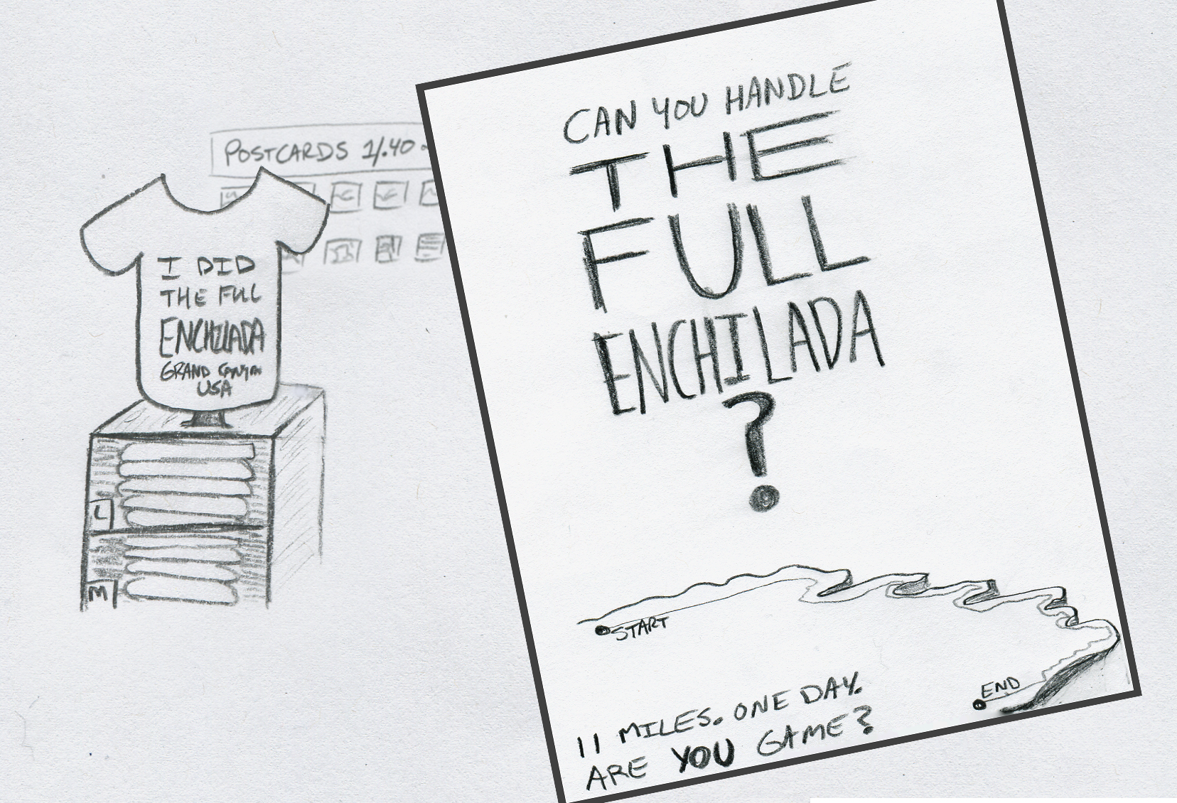
One example of this is rebranding the full length of the Rim Trail as a destination hike. The Rim Trail is 16 miles long, giving it great potential as a landmark hike for visitors, but current trail descriptions and branding make the Rim Trail unattractive to fit visitors. By creating a fun name - The Full Enchilada - and a brand, this hike can entice visitors away from long inner canyon treks that are much more dangerous.
A different framework for organizing the concepts
STAGE 5
CREATING THE THESIS DOCUMENT
In the last stage of the process, I created my thesis book that goes through the entire process, from secondary findings to ideation and final strategies and concepts. Please download or view the official PDF from CMU's Thesis Repository (the viewer is at the top of the first, but the first page is blank, so scroll down to view)
POSTSCRIPT
Return to the Canyon
I had hoped to return to the Grand Canyon to work with the team there and share my findings the summer after completing my graduate studies, but unfortunately a family medical emergency interfered with that plans. I ended up having to postpone my graduation and spent my summer “break” between grad school and starting my post-grad job as a full-time caregiver while competing my thesis work.
One of my reasons for taking a break from full-time employment after my office was shut down in 2017 was to allow me to return to this work and present and socialize my findings and insights with the team at Grand Canyon National Park. I was finally able to do that in Spring and Summer of 2019, working extensively with the Preventive Search and Rescue Lead Ranger.


We then co-designed a share out to a larger group of key stakeholder Rangers from across several key work groups- a rare opportunity within the highly silo-ed NPS system.
Since my initial field study their understanding of the key demographics for behavior change efforts had changed and I worked with them to co-design some updated ideas and strategies to consider given this new framing. I continue to work with the team informally and have been invited to work with several other parks in a similar capacity based on the enthusiastic reception of this project.
NOLS Wilderness Risk Management Conference
I was also able to share one aspect of the project along with some design & design research for-everyone approaches at the NOLS Wilderness Risk Management Conference in 2017. My talk was entitled “You Know Too Much! Understanding & Mitigating Your Expert Blindspot”
Presentation attendees try out a design research technique, giving a neighbor a “Backpack Tour”
WRMC Conference Official Photo by Jared Steinman
FOLLOW-ON DESIGN FOR VISITOR SAFETY PROJECTS
2020 - Present
Since the main Grand Canyon project wrapped up, I’ve had the opportunity to work on several additional engagements on design for visitor safety at National Parks.
I completed an extended engagement with North Cascades National Park in 2021 which included 2 months of on site research and immersion following by extensive concepting. A full brief will be added to the site, but in-depth offline content is available for those who are interested. That project included opportunities across visitor activity areas, but concepting focused primarily around water safety and trip planning.
I am currently working with Wrangell St. Elias National Park in 2022 as they seek to develop a minimally viable PSAR effort in an extremely wild, backcountry park with limited staff and even more limited opportunities to engage directly with visitors. I look forward to sharing more about that when time allows as well!
Both Parks have received press attention due to their seemingly high fatality rates, which in reality, reflect the tiny official visitation numbers at each of these Parks (the denominator in deaths per visitor stat) rather than the Parks’ approach to safety. Both Parks contain vast wilderness areas and attract advanced visitors seeking to engage in high-risk activities.
adDITIONAL Q & A
HOW DID YOU LAND ON THIS TOPIC, OF ALL THINGS?!
I get asked this alot. Well, rather than starting from a particular area of design for my thesis, I wanted to start from a problem, and see how I could help tackle it through design. I was looking for a mini-wicked problem, if you will.
I decided to focus on something that had bugged me for sometime. It’s something we hear about every summer: visitors to National Parks doing seemingly incredibly stupid things that get themselves killed or seriously injured. While experts quoted in the media dismiss the cause of these incidents as sheer stupidity, I suspected there was something more interesting going on, and I wanted to get to the bottom of it.
My initial research confirmed that this was an issue of real concern for the NPS, and they were continuing to try new ways to address the problem. I thought by taking a fresh look at the issue through a design lens, I might be able to diagnose and treat the problem in new ways and help.
Here's the full introduction from my Thesis Proposal:
Each year people make about a billion recreational visit to US National and State Parks: over 280 million recreational visits to the US National Parks. For the overwhelming majority of these visitors a trip to the park ends without injury or death. Yet, despite numerous preventative measures, people do continue to require rescue, and even die, while visiting parks.
What is remarkable about these episodes is not so much their numbers; the vast majority of park visits occur without incident. It is that when incidents do occur, the surrounding circumstances can make the victims’ actions seem not only ill-advised, but downright foolish.
One recent high-profile instance of this occurred in 2011 in Yosemite National Park. A group of visitors climbed over a guardrail alongside the Merced River just 25 feet above the edge of 317-foot Vernal Falls. They stood in the cold, rushing water to play around and take photos. Bystanders urged them to return to safety. Suddenly, one person lost their footing, and fell into the raging river. A second person tried to rescue the first victim, and fell in too. Then a third person went into the water as they tried to help the second. All three perished after washing over the falls.
A Chicago Tribune feature article after the Vernal Falls deaths declared in its headline: “How do you explain park deaths? You can’t. Expert in Yosemite, Grand Canyon fatalities at a loss to explain ‘stupid’ behavior.”
In the piece, Michael Ghiglieri, an experienced outdoor guide and co-author of books detailing the history of deaths in Grand Canyon and Yosemite National Parks, was asked about the recent Vernal Falls incident and similar events where people seem to have thrown commonsense to the wind and found themselves in deep trouble. His expert opinion? “It’s so stupid it’s beyond belief.”
Mr. Ghiglieri’s opinion echoes the collective reaction the public and press often has to these high-profile events: “How could people be so foolish? Clearly, they have only themselves to blame.”
And park staff tends to agree that “human error” is a major contributing factor to injuries and deaths in the parks. In fact, it was cited by 100% of park staff surveyed from 30 National Parks as being a medium or high factor contributing to visitor accidents, making it the highest rated factor in the survey. Human Error was followed by behavioral factors (such as playing, running), age, level of visitor preparedness, and level of visitor experience in activity.
But is this type of behavior really beyond belief? Should we still be surprised, with all we know about human beings that people sometimes do things that don’t seem to make a lot of sense at first glance?
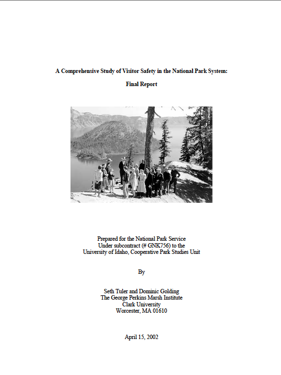
As stated in the recommendations of the NPS’ Report: “Park staff responding to the inventory questionnaire often identified visitor characteristics as significant risk conditions. Staff rarely rated communication or infrastructural hazards as important conditions contributing to visitor accidents. Some factors perceived as problems related to visitor judgments and behaviors, however, could also be understood as failure in communicating relevant information successful to visitors.”
In other words, is attempting to reduce human error not a key responsibility of safety communications, rather than something that falls outside of it?
The Report goes on to state that there is a real gap between this staff perception of bumbling visitors, and the perception visitors have of themselves: “…park staff members believe that visitor preparedness and level of experience in a given activity are important contributors to visitor accidents. Most visitors, however, considered themselves experienced in their chosen activity and many indicated that they were prepared with appropriate shoes, clothing, water, etc.”
This difference could be a result of self-reporting bias, but it could be something much more troubling. Do visitors think that they are heeding warnings, being prepared for activities, when in fact they are mistaken? And are park staff members dismissing this mismatch as human error, rather than recognizing a critical communications failure. Whether it is due to miscommunications, or “human-error,” if parks know that visitors will err, should they not design with that in mind?
WAS THIS IRB APPROVED?
No one actually asks this, but that process is a pain, so I'd like to give myself credit for this. Our thesis projects were required to go through the IRB approval process, and while I did pass as a IRB-exempt study, that still added additional constraints especially on recruiting for and conducting user research.
Becoming an official study at a National Park also involves a large waiting period and alot of red-tape, so I worked at the park with permission from the SAR Ranger team, but without official approval as a research study. This meant my interaction with visitors needed to be limited to observation and informal contact.

